 Back
Reshaping approach to Insurance for years ahead
Our task was to rapid prototype a product including website on all major devices and branding. Clients vision was to build fresh product for customers who want to manage their insurance in way that is suitable for 21st century.
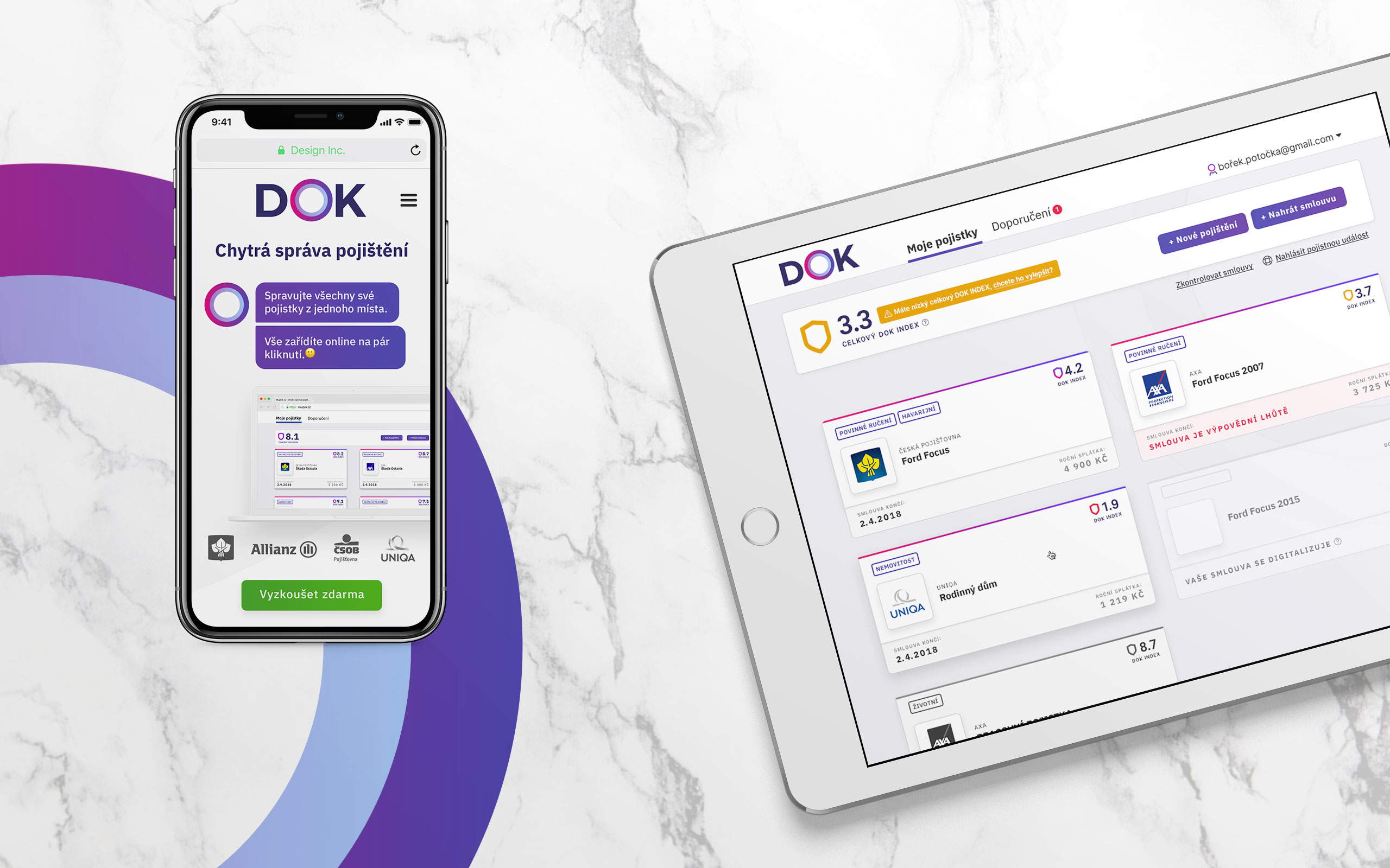
We were approached by Homecredit with request to build together a platform for next generation of insurance services. Because we love challenge and the idea itself was interesting we joined their cause. Our task was to build identity that was fresh, smart and communicates all the benefits. Apart from identity we also helped build their website and whole application.
Here's how it works. Users submit their insurances via computer or just by snaping camera button on their smartphones. Then the machine learning and complex algorithms get to work. User gets insurance score called DOK index. With that you also get suggestions how to improve your insurance. Why pay more for less, right?
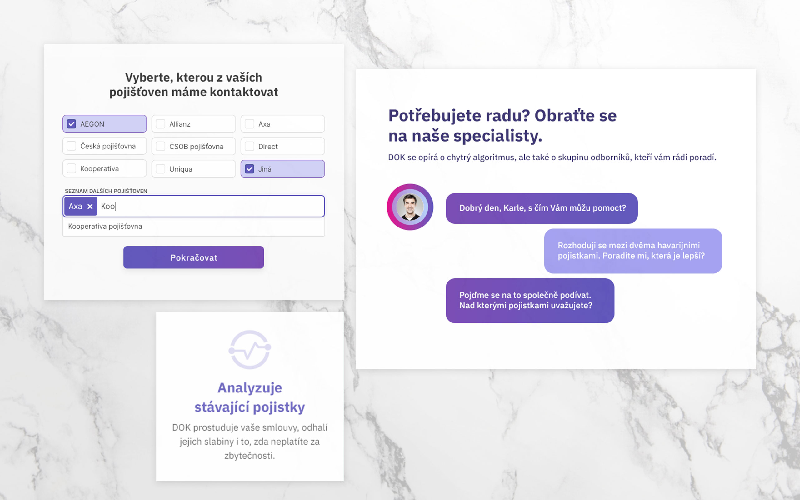
Early users will be tech-savy people who don't have time to check their insurances one by one. They know how convinient is to find song they've heard on radio, call nearest taxi or rent appartment half world away. Everyday tasks are as simple as they can be and that's what they expect from insurance too. We put a lot of effort to make the usage as simple as it can be.
Then there will be the general public. We took special care to make the interface as simple as possible. Product website, which will be main hub for new customers, will explain main functions and benefits. Then onboarding and application itself will give customers small hints for better experience.
The starting point was identity and onboarding. We worked on both parts simultaneously to ensure unified feel & so that development team could work on the project in very short time. This part of the project was the hardest – we lacked time to explore more different approaches. Eventually we settled on three main styles which we presented to client.
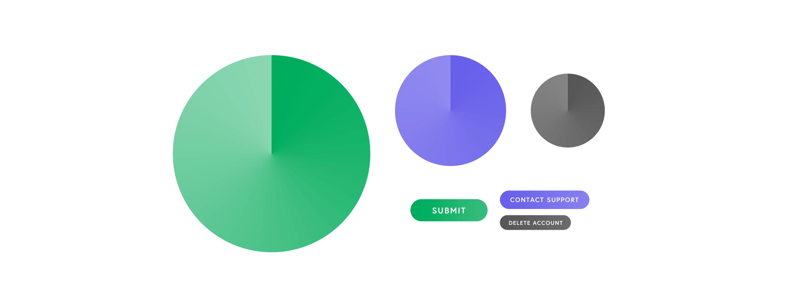
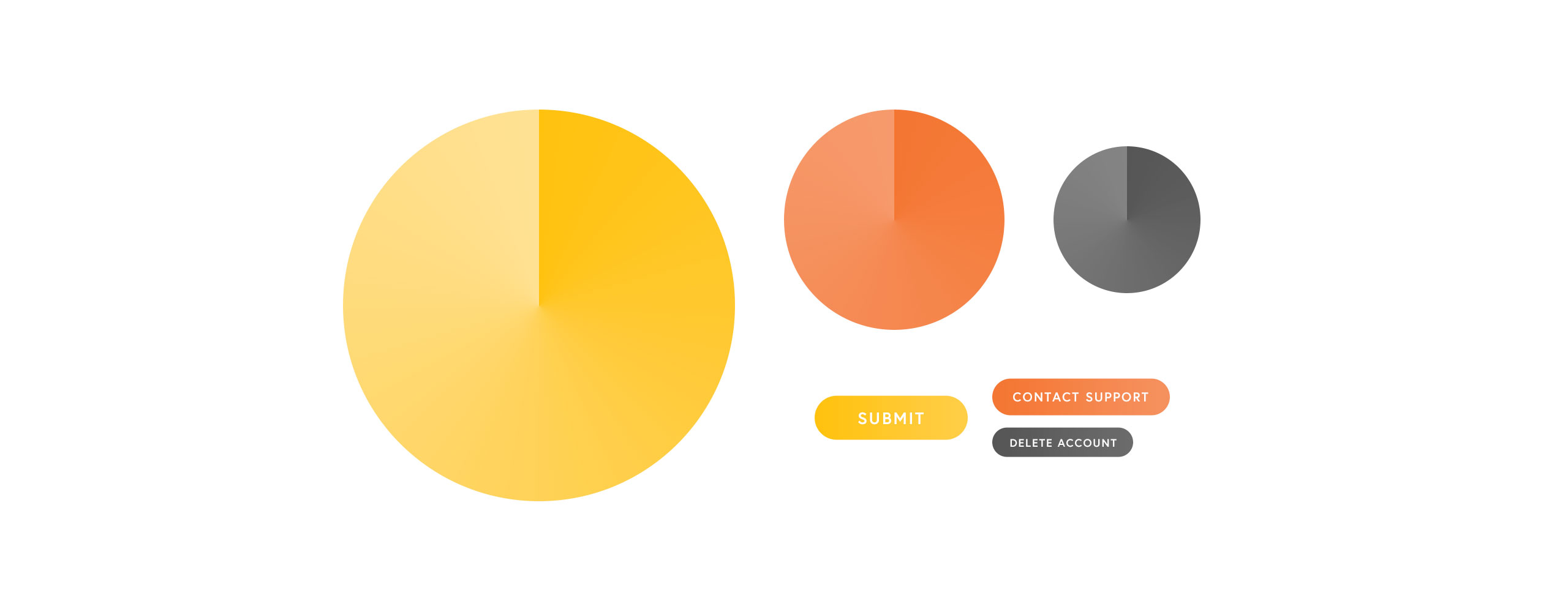
Client's brief encouraged us not to use blue color. He wanted to stand out from comptetitors. That led us to green with purple, yellow with light-green and light-blue with pink. We cheated a bit with the light-blue color, but it was distinguishable enough from their competitors so we let ourself try that. Our client liked the green and purple combination but after several iterations we ended up with dark purple and pink color.
To support our color choice we picked three different fonts and with them designed different UI components. There was Nudista – a technical one. Poppins – very excentric. And finally IBM Plex Sans that won the competition. With complete identity we could finally make more progress on onboarding.
We designed whole process for desktop, tablet and mobile devices. Every step was important and there were many. Cutting content, so the process is faster, was not a way to go. We've maked sure there was always some sense of progress and that user understands, that we need all the information, to make his experience better. When it was needed we added tooltip to certain parts to further explain process to customers.
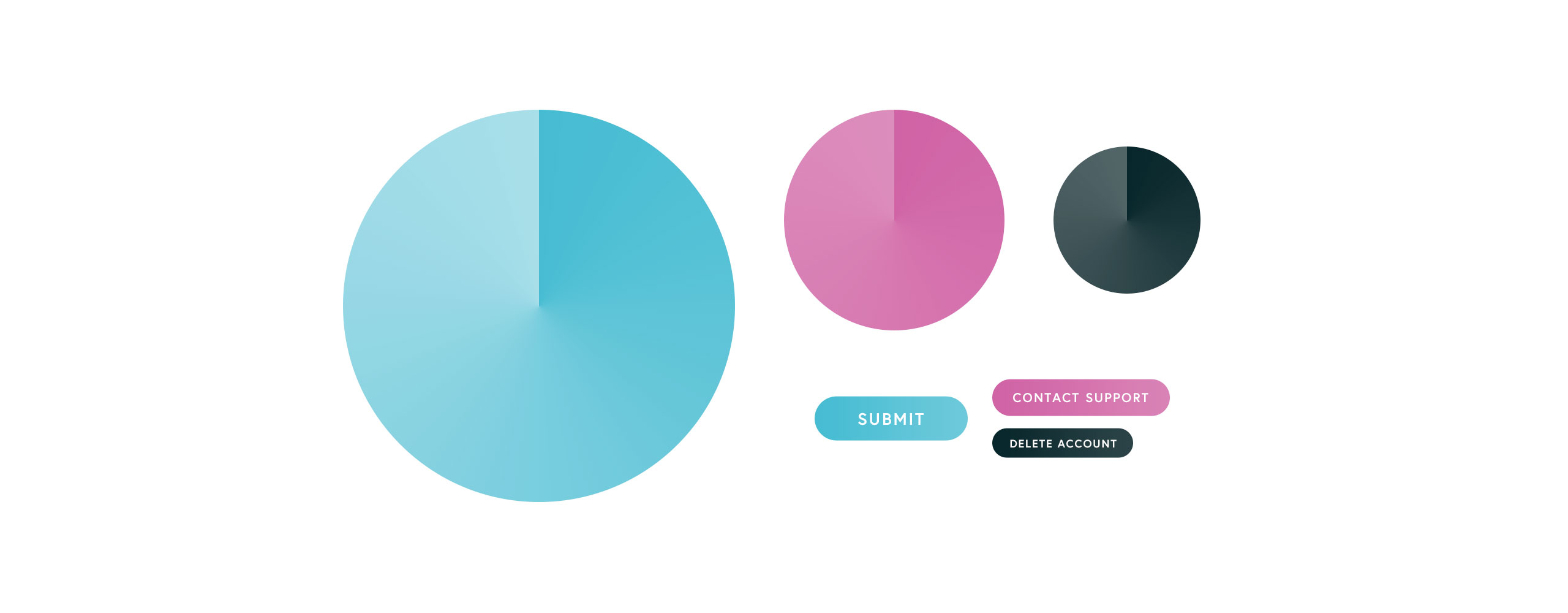
The components itself were most fun to work on. We designed whole lot of them and gave them interactions & different states. The interactions were developed on our own. Before we've added them to the development team, we've made our own prototypes, so we can properly test them.
Working with 23YL was a quite a ride. It was essential for us to create a high-quality MVP in a very short time. 23YL helped us design a product which is distinguishable from other products on the Czech insurance market. I appreciated their open-minded attitude and ability to try new and different approaches. They quickly adapted to our agile processes and were able to iterate every small visual detail.
Zdeněk Klůc, UX Designer at HomeCredit a.s.